Picky about pie charts? Bored of bar charts? Try a treemap!
Thinking 'Inside the Box' with Treemaps
Everyone has seen a million bar charts, though they continue to be popular for a reason, and it’s now popular wisdom that a pie chart should rarely be used simply because of, well, the stigma. Okay, that’s unfair. The pie chart has some deeper problems. One of the fundamental issues has to do with how a pie chart uses its real estate. This isn’t unique to pie charts, but space is limited for labels, and the whole center of the chart is essentially wasted space since the slivers are too hard to see (and no, a “donut chart” is not a real solution). Slice size is often unintuitive and hard to distinguish. For example, the following chart is very humorous and interesting, but as a chart itself, it’s offensive to the eyes:
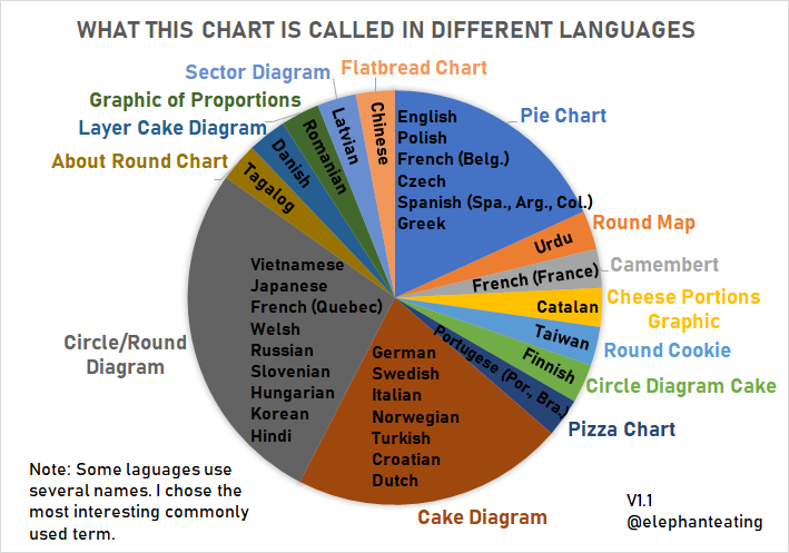
Well, there’s good news. In almost every scenario in which you’d want to make a pie chart, you can make a treemap instead! And it will be much more socially acceptable. Not only that, but there are actually a number of other good scenarios where a treemap can be very useful, even cases where it might not be the first option that comes to mind.
How can I make a basic treemap? Is it really the same as a pie chart?
For our purposes, we’ll be using the treemap package in R. We’ll use some real data later, but a good way to start is the built in auto-generator of the right kind and format of data for our purposes. Note! You’ll want your data set up where each column has the value of the level of “depth” that you want - if it’s not set up that way, you might need to pivot wider or longer as the case may be.
# Let's install and load the package
install.packages("treemap")
library("treemap")

# If you want to get started right away, you can generate an example dataset:
example <- random.hierarchical.data(30)
# And then graph it. The short version:
# Index contains all category columns, vSize is the "actual data"
treemap(example, index = names(ex)[1:(ncol(ex)-1)], vSize = "x")
One line graphing, nice! Note that the core documentation (located here) has the complicated looking selection above for the columns, and I’ve followed their lead, thought they don’t mention why. This is just so that the auto-generation works no matter how many columns you create. However, you can always just manually specify them as well and they will evaluate in order (biggest to smallest level of category, in terms of nesting) if you pass them as a vector of strings. Here’s the output of this classic “tester” treemap.
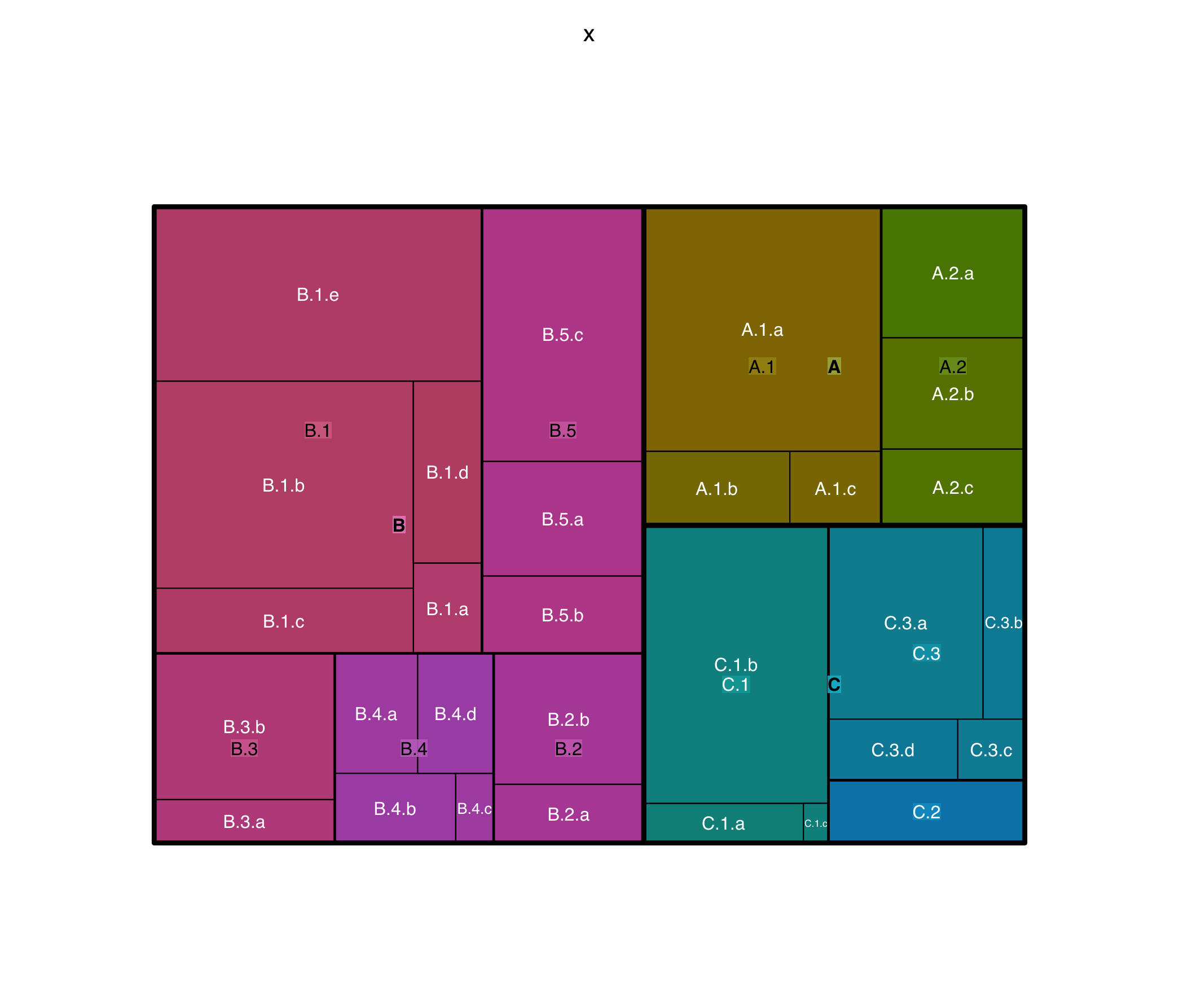
Let’s do a basic treemap, as a pie-chart killer, with some real data. I’ve grabbed a simple one-dimensional dataset from the AP’s Iowa Republican Caucus results. Note that these vote totals are “parts of a whole” so we can use a treemap. I should mention that while you can use a treemap for regular bar chart things, the sizing of the boxes still isn’t quite as easy to compare, so it’s not the ideal tool, though it still works. Here however, there is a finite pool of votes, so we’re in the clear:
treemap(dtf = caucus, index = "Candidate", vSize = "Votes", type="index")
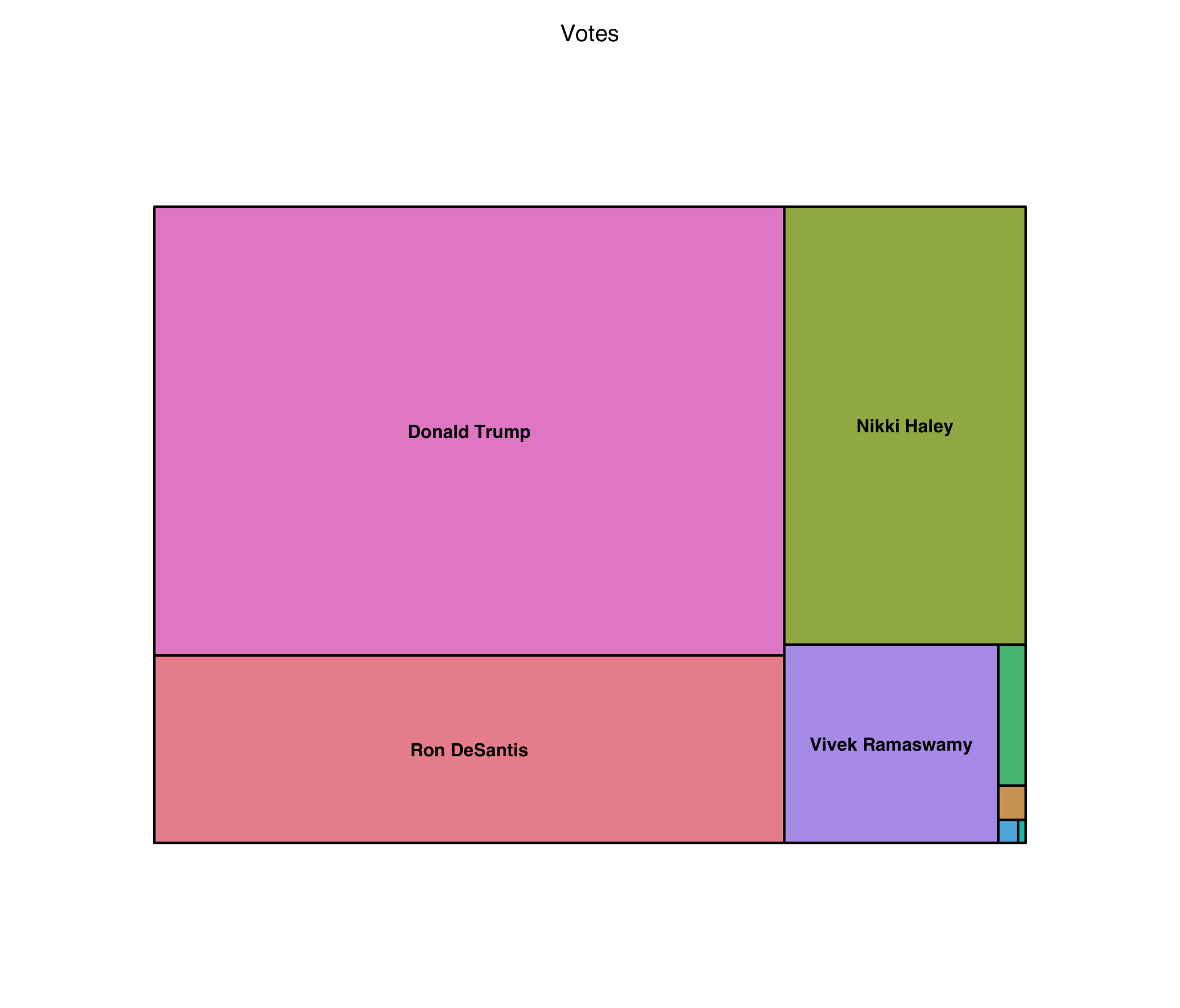
As you can see, it definitely works, but is it better than a pie chart? I still think so, but I’ll leave it up to you. The smaller pieces are less distracting and it looks far more modern.
Can I use the treemap for anything else? What’s the ideal use case?
Let’s take a look at some budget data! Off of data.world we have the 2017 budget line items for Grand Rapids, MI.
gr <- "FY17-final.csv"
gr <- read.table(file = grpath, sep = ",", header = TRUE)

# A single, lonely negative number causing problems
# ...but it was small enough to just drop:
gr <- gr[-c(17),]
treemap(dtf = gr,
        index = c("org_description", "account_description"),
        vSize = "amount",
        overlap.labels = .7,
        fontsize.labels = c(16,10),
        fontcolor.labels = "black")
# I also made some tweaks to the label output font and positioning
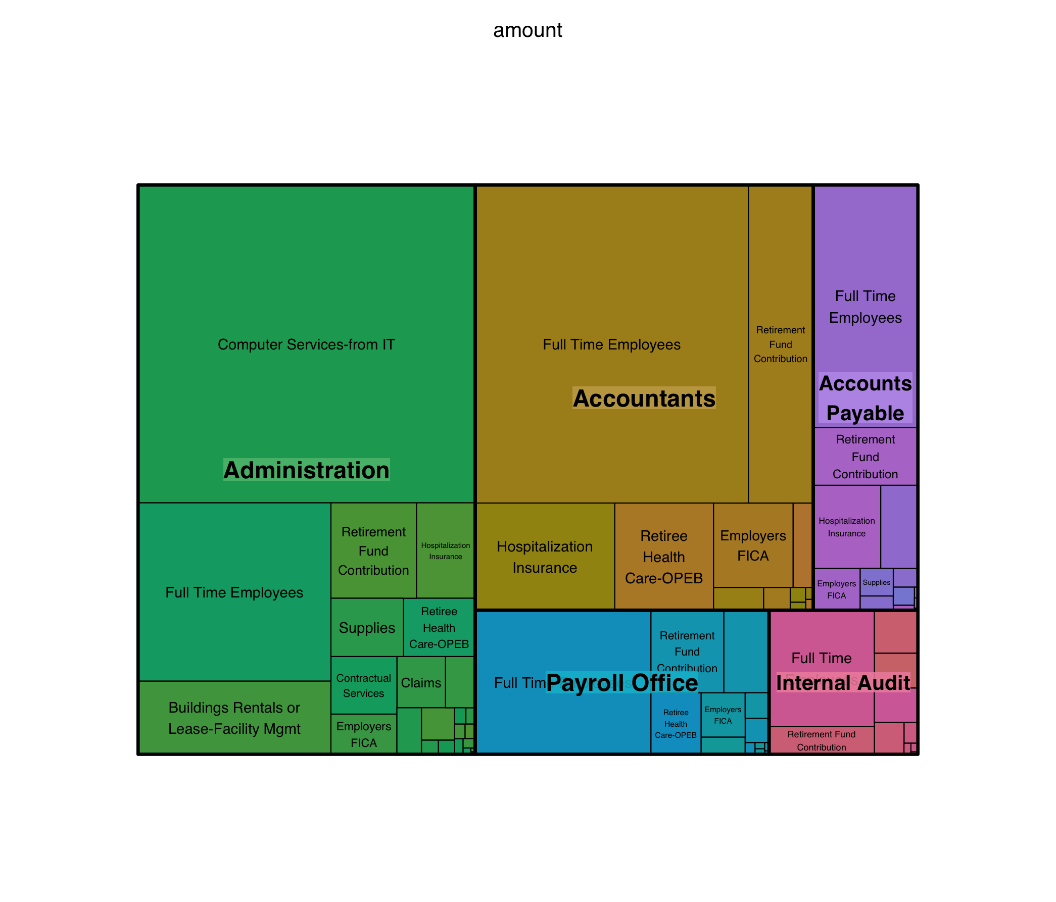
Here we run into an important issue! Treemaps do not work with negative numbers. At all. Alternatives exist, and in some cases can actually be helpful! For example, many corporations will do treemaps where expenses are red and revenue is green.
Overall, though, note how well the chart works for a variety of audiences. The information density is a great balance of top-line impressions, which are easy to see by size and color, and more detailed information if you decide to look more closely.
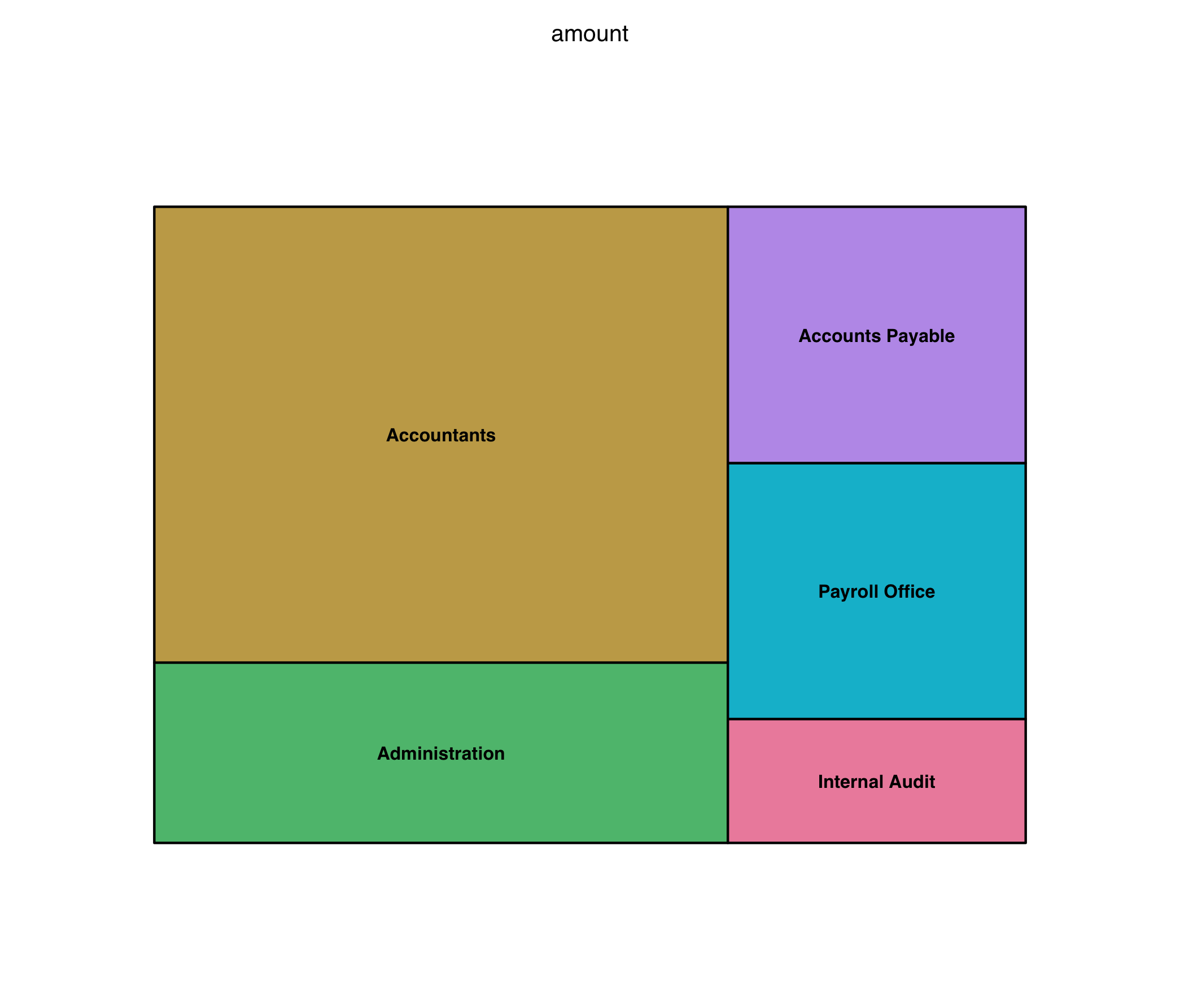
You can, if you know your data well, do things “backwards” too, although of course a bar chart is always going to be a helpful and slightly more accurate option, if we’re being honest. For example, in our grand rapids dataset I notice that full time employee salaries are a huge contributor. So then, I might make a graph to look at just those, compared to each other! A bar chart works, but here the implication is that you want to communicate “parts of a whole”, so arguably the treemap is actually superior, even if the exact relative sizes of the boxes isn’t as clear:
gr_employees <- subset(gr, subset = account_description == "Full Time Employees")
treemap(dtf = gr_employees,
        index = "org_description",
        vSize = "amount")
So, when exactly should I use a treemap?
We’ve discussed already that you can often use it in any pie chart scenario, with only a single level of depth.
However, overall I’d say you should look to use it when:
-
There’s the implication of “parts of a whole”
-
You have exactly two or three (two is the sweet spot) levels of nested, heirarchical categories of data
-
You have one positive, numerical piece of data for each bottom-level subcategory
-
The highest division of the data is the most important
-
You (optionally) want to draw special attention to a disproportionately large piece of data, on any level
There are some downsides:
-
Tons of small, tiny pieces of data that overwhelm the viewer OR one giant piece that overpowers everything else
-
Sometimes the old fashioned bar chart is more readable
-
Overlapping labels bother you or you don’t want to spend extra time on making in extra pretty
Further fun suggestions
R also has an easy-to-use package that can address a few of these concerns: the d3treeR package lets them be interactive, so you can see the top-level at a glance and mouse over things to see the inner divisions!
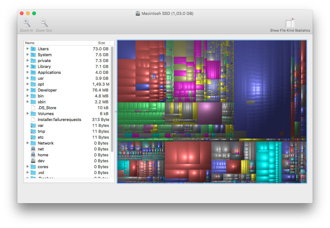
One real-world example of this kind of interactivity is a really great solution to the problem of finding what to delete when your disk space is really full. DiskInventoryX (Mac) and WinDirStat (Windows) both implement this quite nicely, realizing that it’s often easier to visually navegate than it is to spend forever clicking through a mess of nested folders.
I hope this post helps you appreciate the wonderful world of treemaps!